Virgil Abloh, the founder of Off-White, disrupted the fashion industry with his genre-bending influence over design culture. As a tribute, I coded an interactive site on behalf of Virgil's personal principles of design, based on a talk he gave at Harvard. The minimal layout matched with skewed, moving elements puts Abloh/Off-White’s aesthetic on full display.
Skills
Website Design
HTML/CSS

Overview
DECISION / REASONING
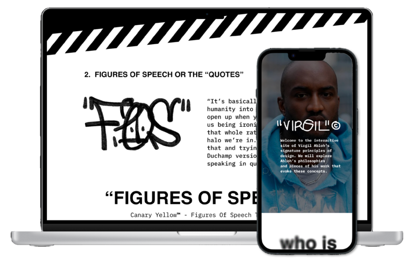
WHO IS VIRGIL
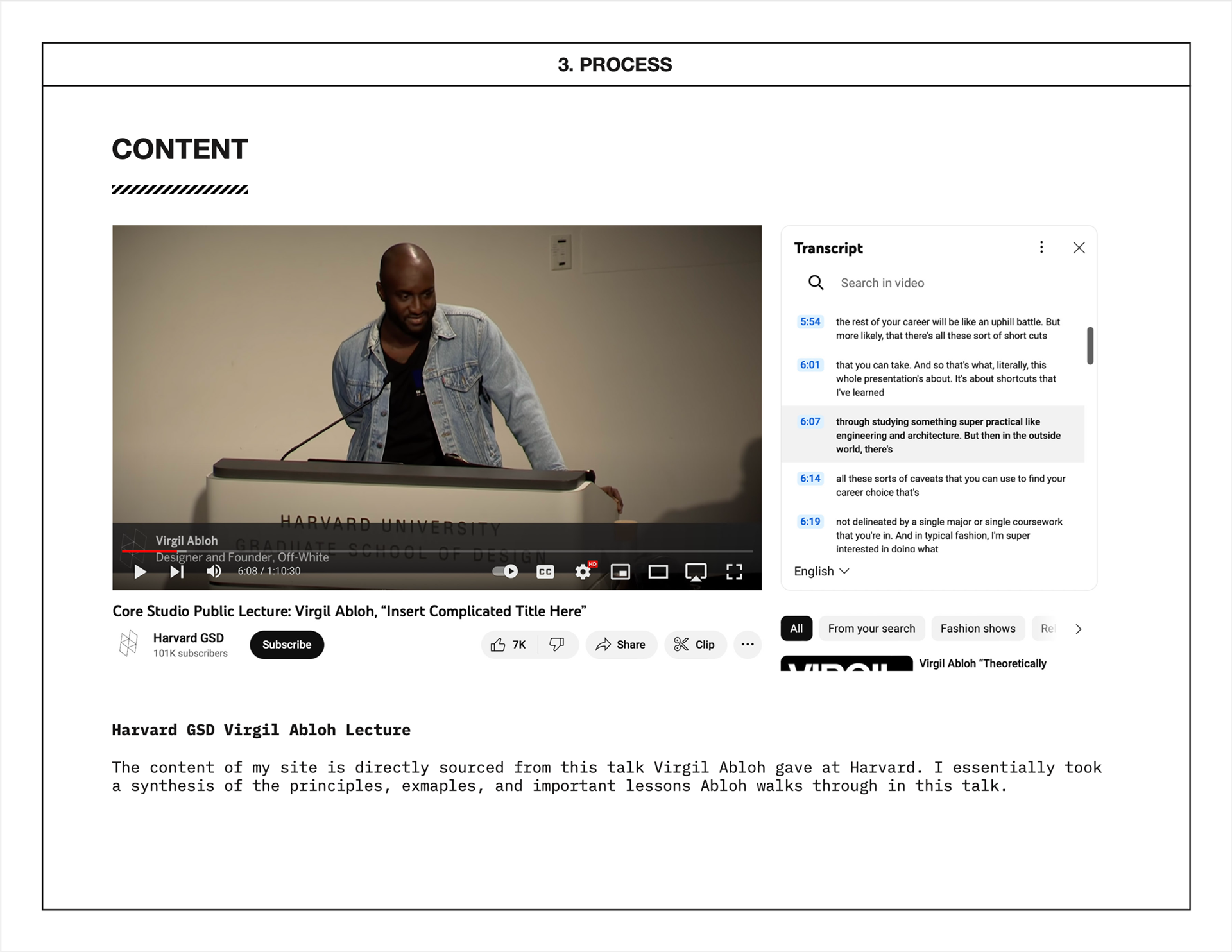
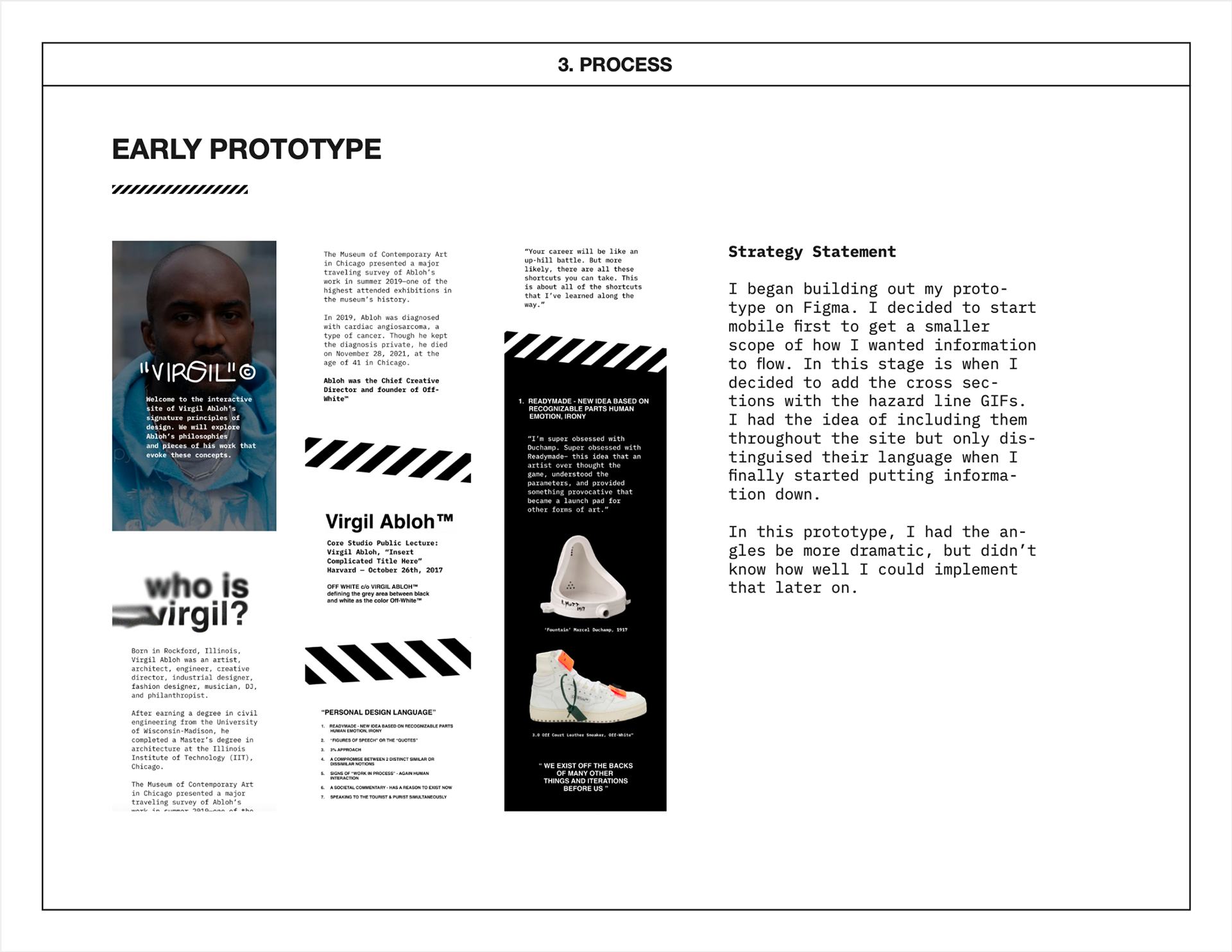
Virgil Abloh, a multidisiplinary designer, was the founder of fashion brand Off-White. Abloh broke all the rules and changed the luxury fashion game. His contributions to fashion and design through his creations will never be forgotten, but it’s his legacy that will live on. I wanted to commemorate his influence over the world of design and streetwear by creating a website dedicated to his Signature Principles of Design Talk he gave at Harvard in 2017.
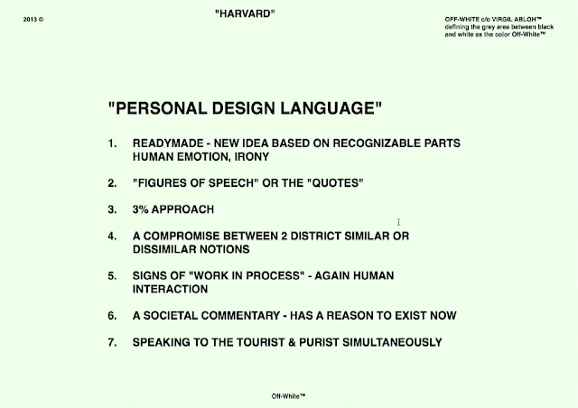
Image Courtesy of Kevin Evans (https://kevevans.com/virgil-abloh-design-principles/)
STRATEGY
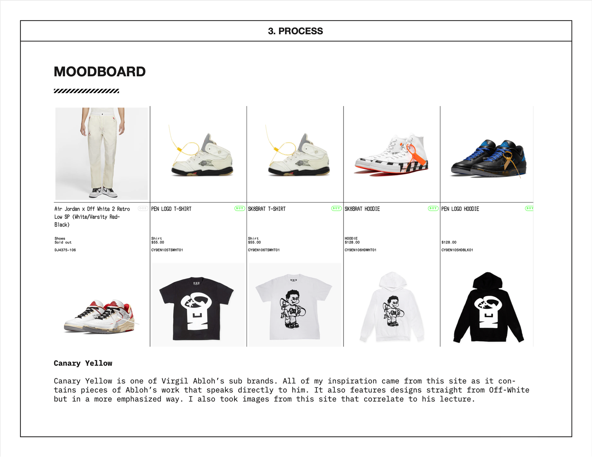
INSPIRE WITH OFF-WHITE'S PHILOSOPHIES
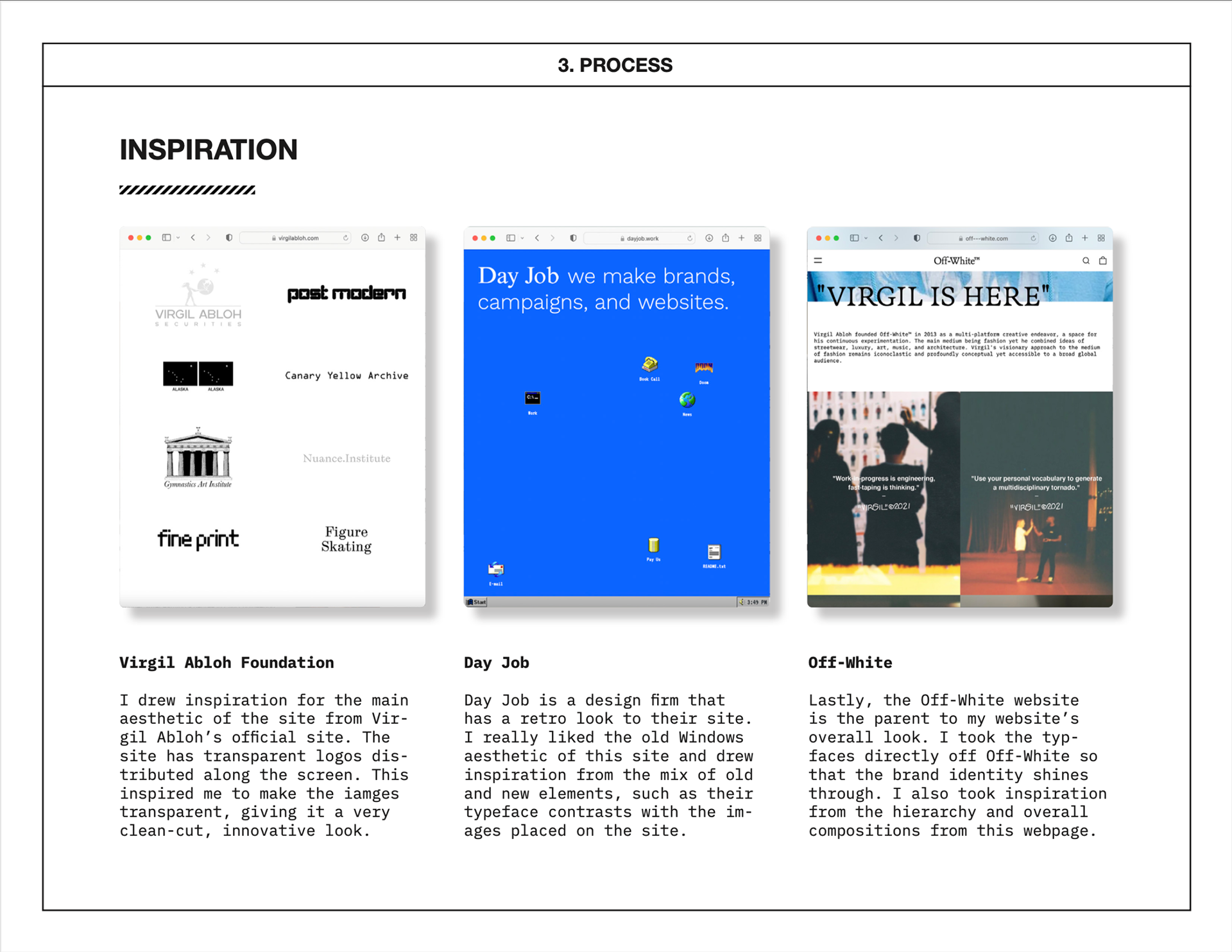
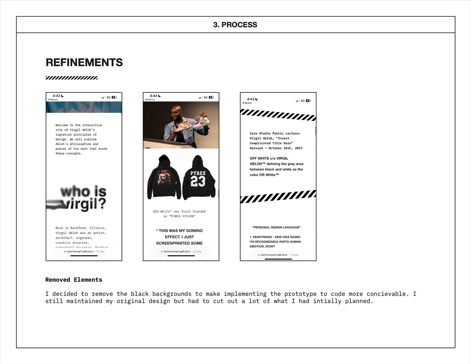
To embody the serious and abstract quality of Virgil Abloh’s principles of design, I wanted to keep the overall aesthetic of Off-White’s existing brand identity. This was communicated through use of the his brand typefaces and graphic images tailored to Off-White. Elements such as moving hazard lines to create content breaks, transparent PNG images floating around the site to create a high-tech feel, and a simple color palette with black and orange accents were utilized to convey Virgil's design identity.
SOLUTION
INSPIRE VIEWERS WITH VIRIGIL ABLOH'S PHILOSOPHIES THROUGH AN INTERACTIVE WEBSITE THAT SPEAKS TO HIS PERSONAL LANGUAGE.

Research / Process

Reflection
WHAT I LEARNED
EMBRACE AMBIGUITY
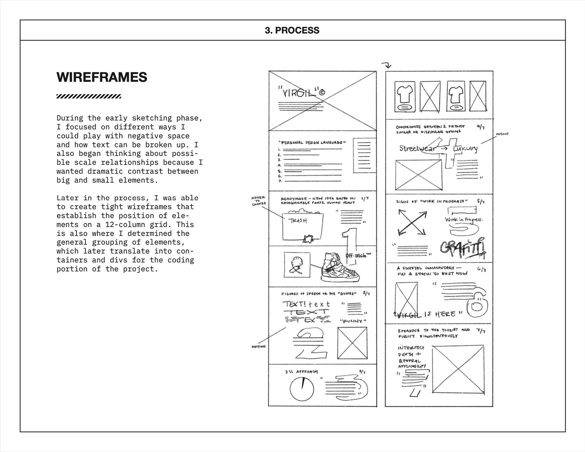
This was the one of my first few attempts at coding in HTML and CSS. There were times throughout this process where I felt like I was going to fail. After designing on Figma, it took me a while to actually start coding as it felt like such a daunting task. This project ended up being an entirely generative process. I was testing out multiple ways to get animations to work with CSS and ended up creating GIFs. I taught myself how to use CSS Skeleton in order to make the website responsive on desktop and mobile configurations. There's a quote by Patrice Martin that I felt like resonated well— "We want to give ourselves the permission to explore lots of different possibilities so that the right answer can reveal itself." Although I encountered several failures, I managed to produce something that I felt addressed all my goals. This project was truly a labor of love and a product of experimentalism.