VEED.IO is a up and coming video editing site, designed for creators to edit and publish their work through a web-based platform. Our team was tasked to help improve business and engagement within the current scope of the platform. After extensive research, we redesigned VEED to include new collaborative tools for users to form communities, learn video editing skills from one another, and explore works of other creators.
In collaboration with Caroline Ferguson and Kristian Kottcamp.
My Role
Competitor Research, User Personas, and Journey Mapping
UX/UI Design (Explore, Video Player, Highlights, and User Profile Pages)
Information Architecture and UX Strategy
01 Background
WHAT NEEDS FIXING?
THE PROBLEM
Although creators can publish work, users have expressed a lack of collaboration within the site—whether it’s giving feedback on a specific video, sharing tips & tricks, or working on a shared project.
WHERE'S THE VALUE?
OPPORTUNITY
Including communities and social aspects on a platform is incredibly beneficial for a startup video-based company like VEED.IO. Although creators can publish their work, users have expressed a desire for more collaboration on the site. By fostering a sense of community, users are more likely to engage with the platform regularly. Interaction through comments, feedback, and collaborative projects keeps users coming back, increasing overall user retention and satisfaction. This exchange of expertise helps users improve their skills and produce higher-quality content, enriching the platform with a wider variety of video content.
We want to build community within VEED, where users can connect, collaborate, and discover like-minded video enthusiasts. By adding features such as an explore page, community tabs, and a messaging chat, VEED can become the ultimate hub for all video needs.
SOLUTION
CREATE AN ENGAGING TOOL FOR VEED.IO THAT FOSTERS COMMUNITY, COLLABORATION, AND KNOWLEDGE SHARING AMONG USERS.
02 Research
PRODUCT RESEARCH
WHAT IS VEED? WHO ARE THE COMPETITORS?
VEED currently has 1 million users and annual recurring revenues of $7 million (as of 2022), and has leveraged the ‘freemium product’ model to grow their customer base. Their audience consists of 64.27% male and 35.73% female, the largest age group of visitors being 25 - 34 year olds. (Source: SimilarWeb) VEED offers: Video editor, screen recorder, subtitles/transcription, VEED Blog, and video guides.
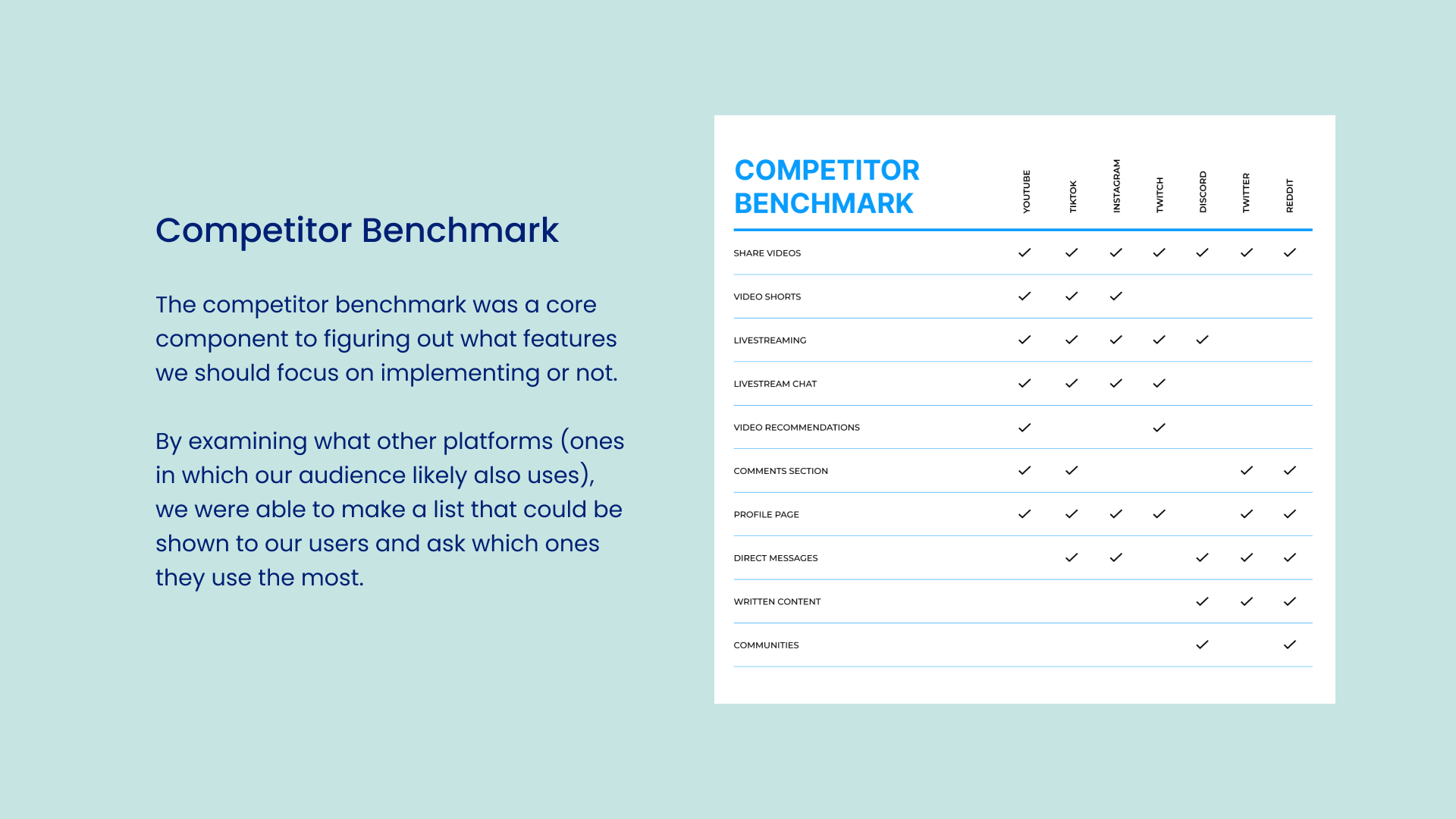
After performing competitor benchmarking, we discovered that VEED offers more video editing features than its competitor sites. But with no video sharing, commenting, user profile, community, and messaging options, there’s a discrepancy in collaborative and interactive features for users. Additionally, VEED does not have a page for users to explore content in a streamlined way with short and long form content, causing a lack of engagement to their site.

FRAMING
WHO ARE VEED'S USERS?
In order to frame the scope of our project, we began by discussing what our key user looks like and how they would engage or collaborate within VEED.
USER RESEARCH
SURVEY
To collect insights about what features people like/dislike in community, video-based platforms, we conducted a user survey.
Our Key Takeaways:
1. Majority of respondents stated they prefer engaging by comments, direct messages, and servers/community.
2. Servers/Communities was the highest rated in forms of collaborating with others.
3. Explore, recommended videos, direct messaging, and video analytics were the most preferred tools.
2. Servers/Communities was the highest rated in forms of collaborating with others.
3. Explore, recommended videos, direct messaging, and video analytics were the most preferred tools.
USER EMPATHY
USER PERSONAS
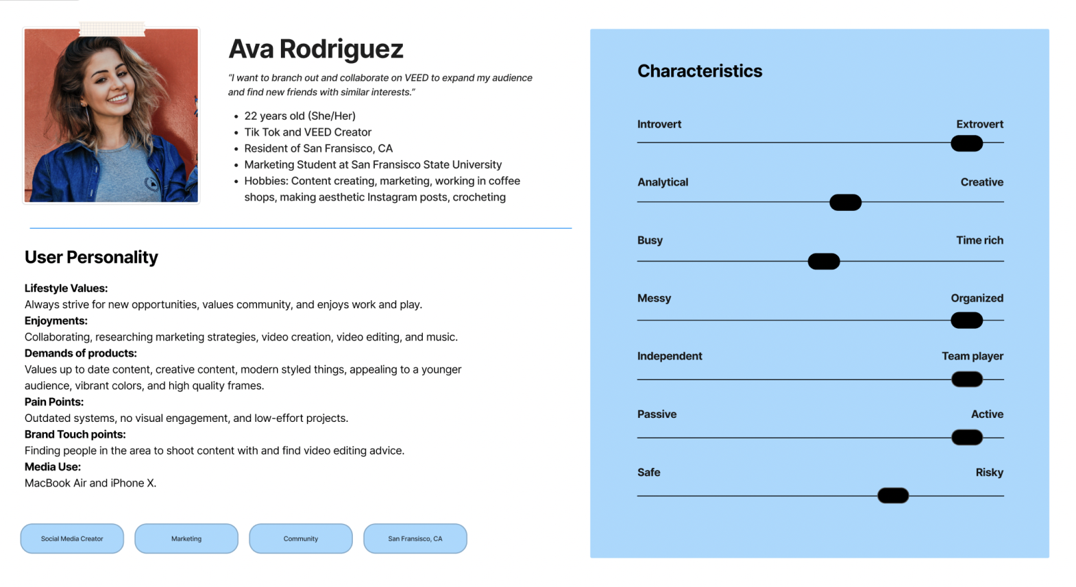
We developed user personas to create reliable and realistic representations of our key audience. To gain deeper insights into user needs and identify pain points, I created a user journey map for each persona.
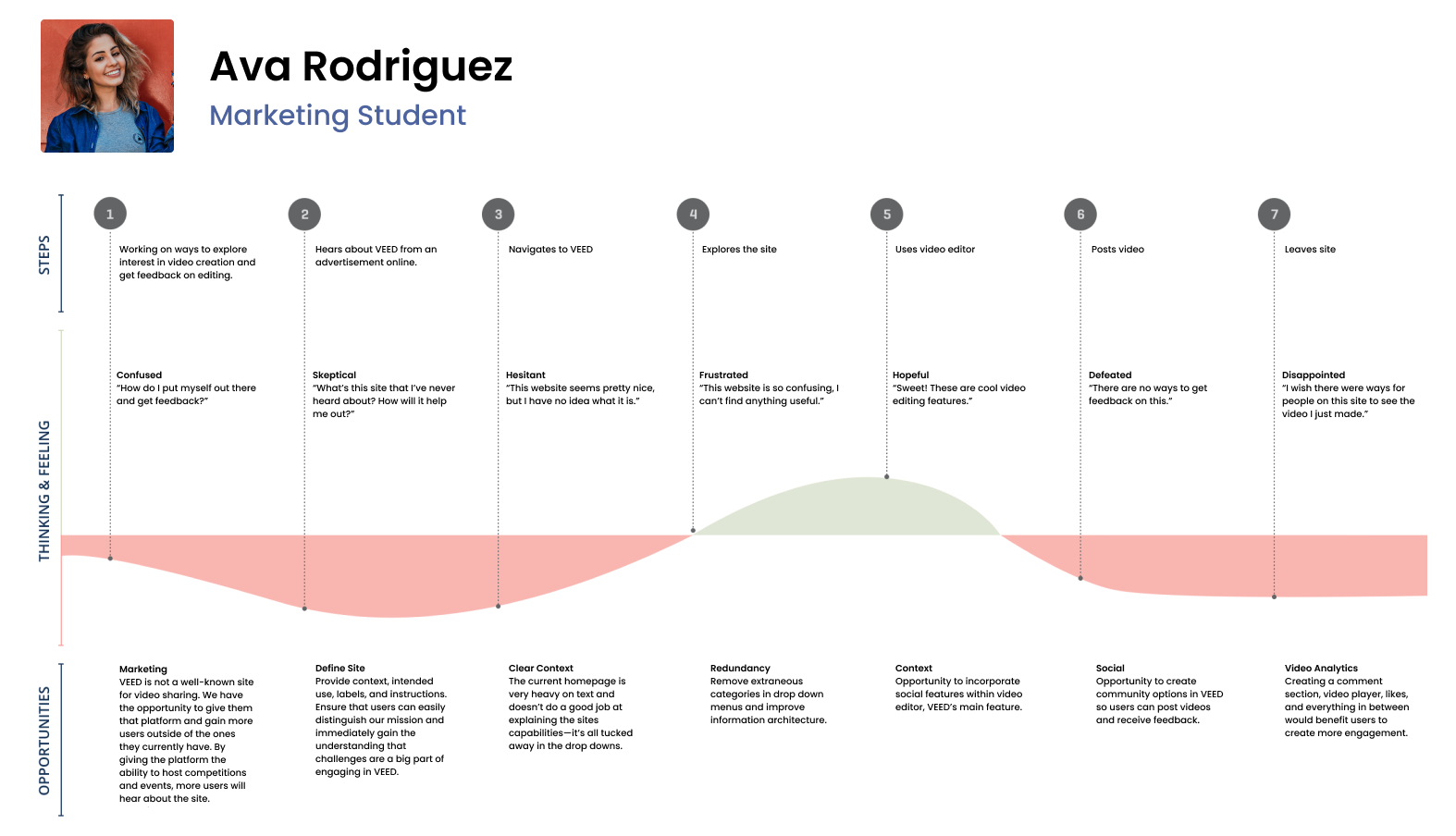
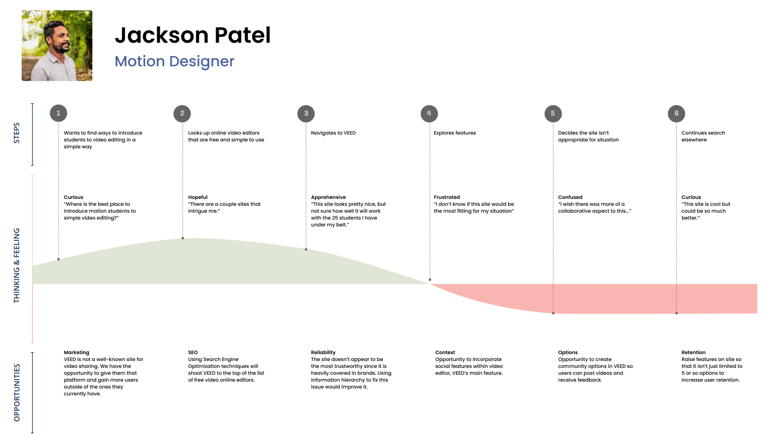
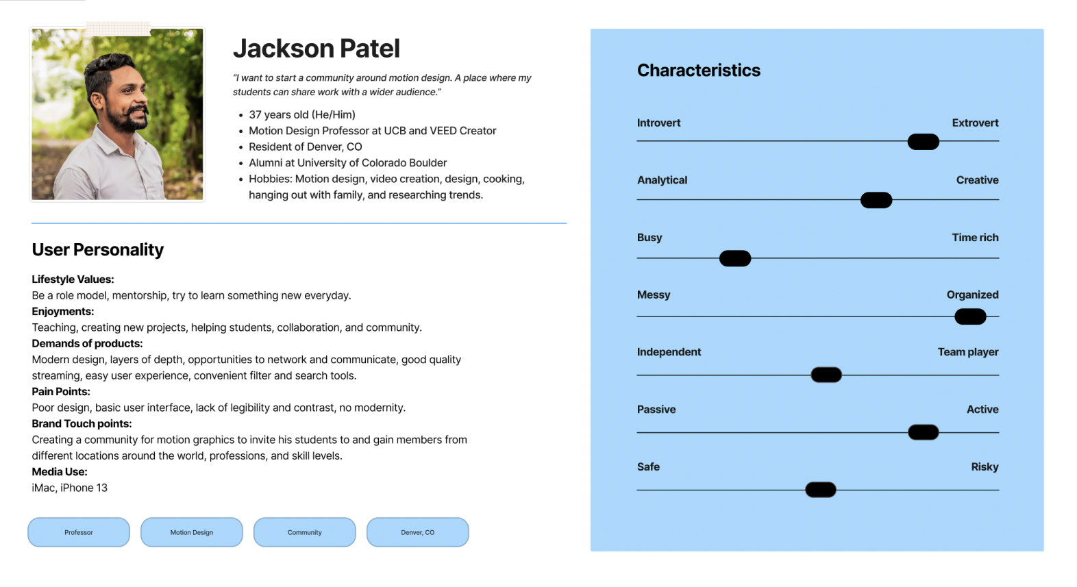
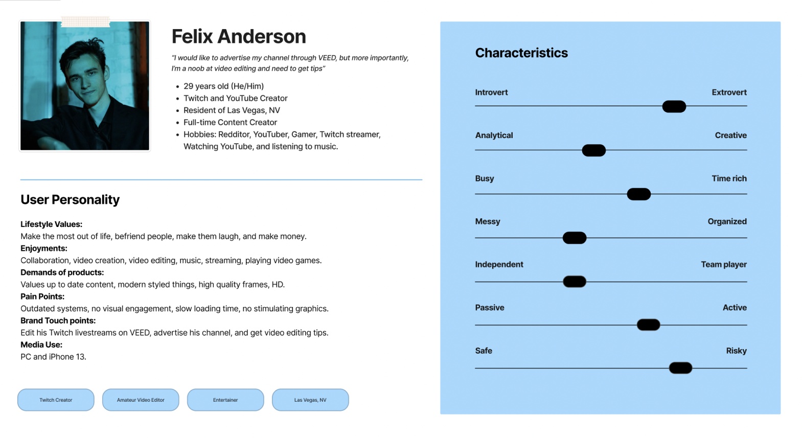

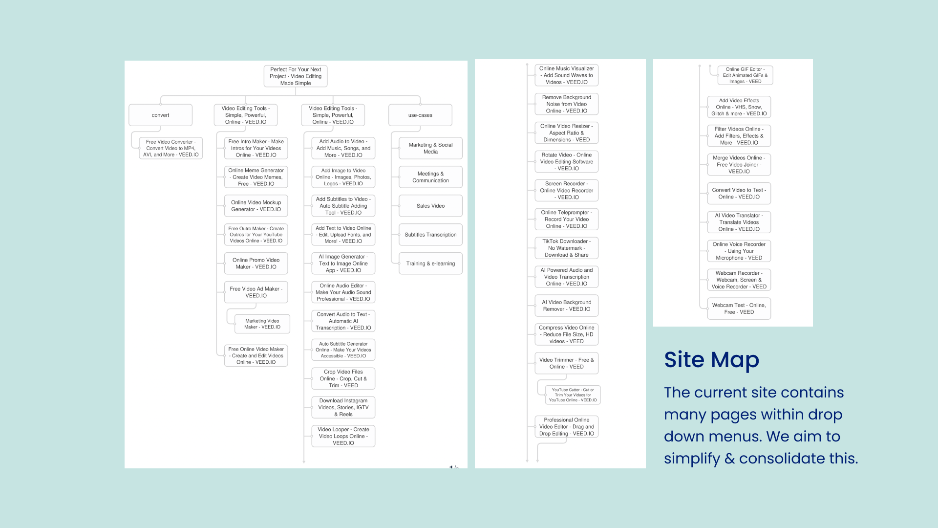
This analysis revealed several significant issues: poor information hierarchy on VEED’s current site, a lack of social features, and the inability to share videos directly within the platform. These findings highlighted the critical need for collaborative tools that would greatly benefit creators.
VALIDATING HYPOTHESES
HOW MIGHT WE?
To help cluster and translate our findings, we asked ourselves a series of 'How Might We' questions:
DEFINE
OUR SOLUTION
03 Solution
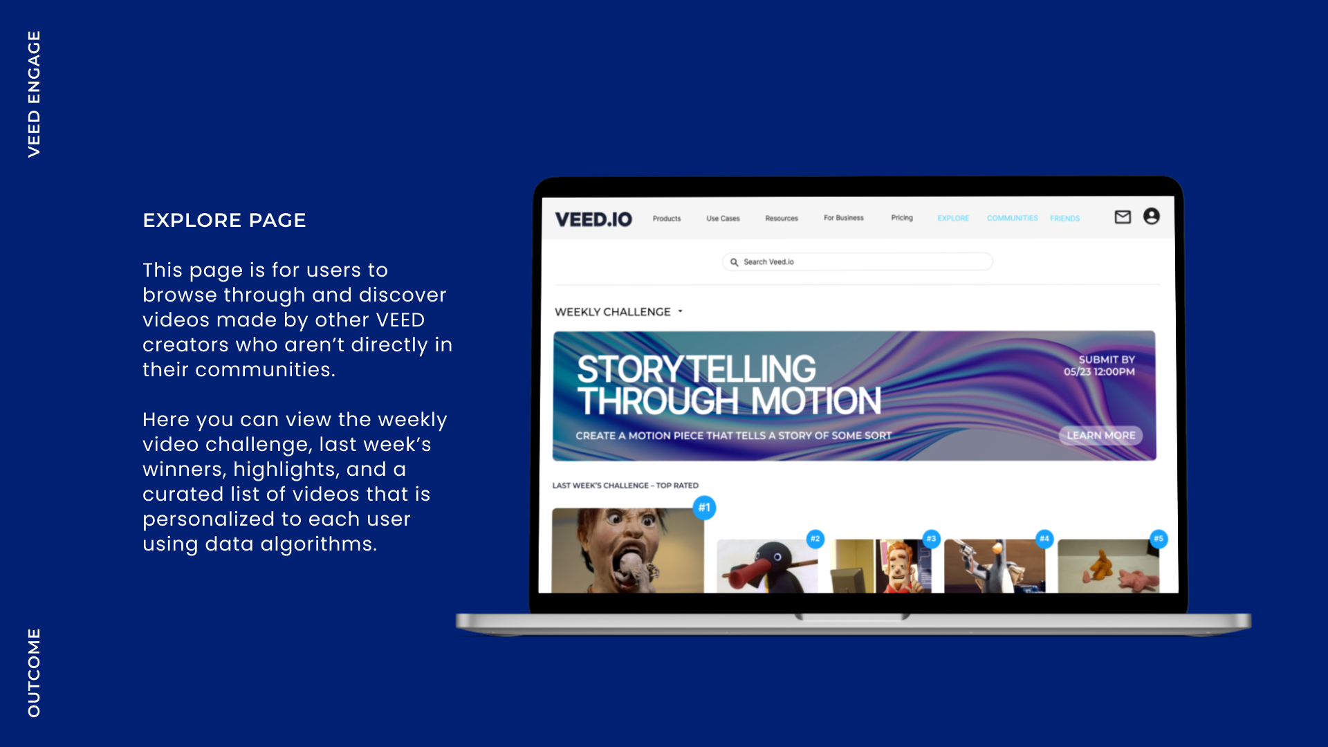
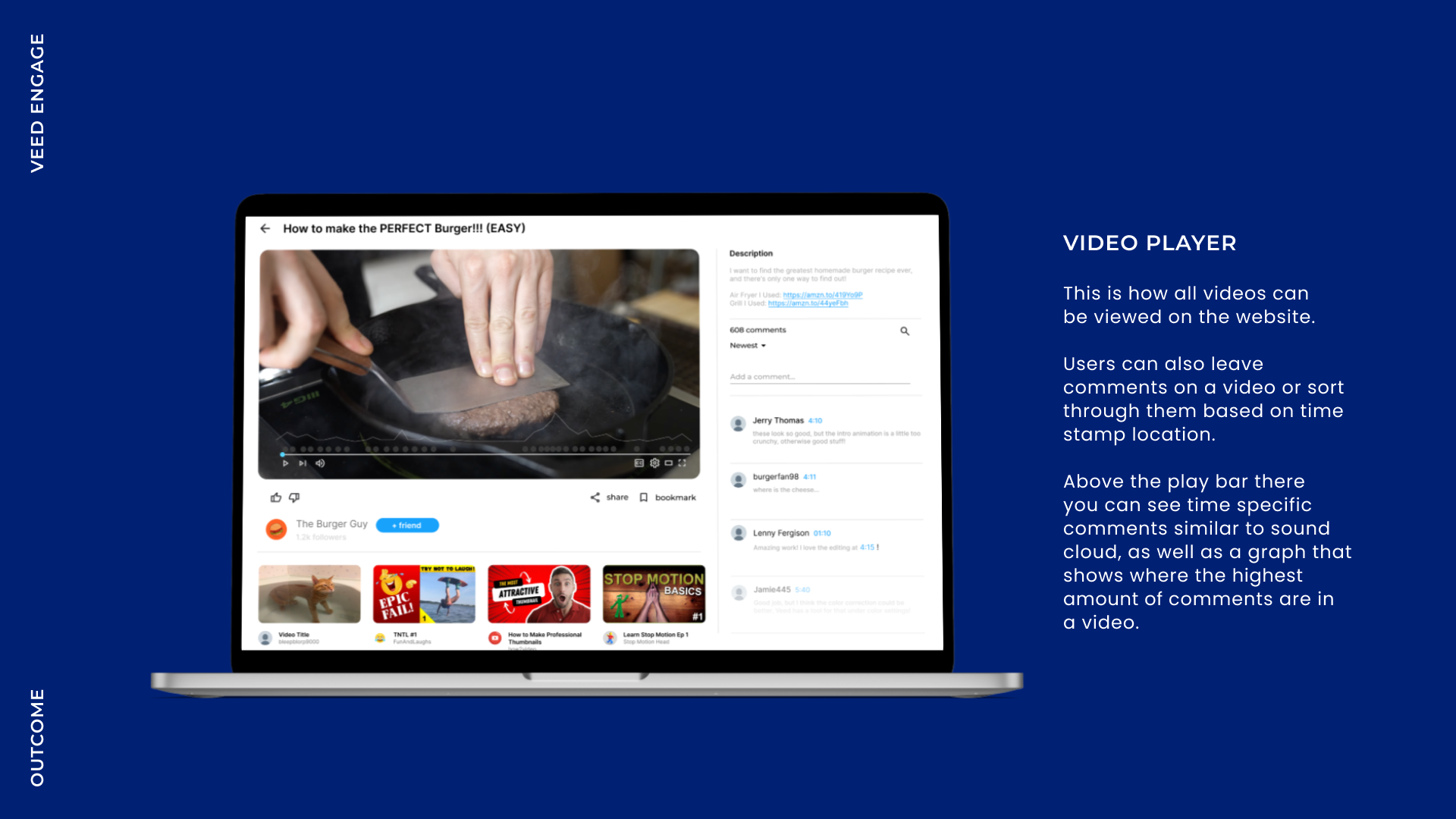

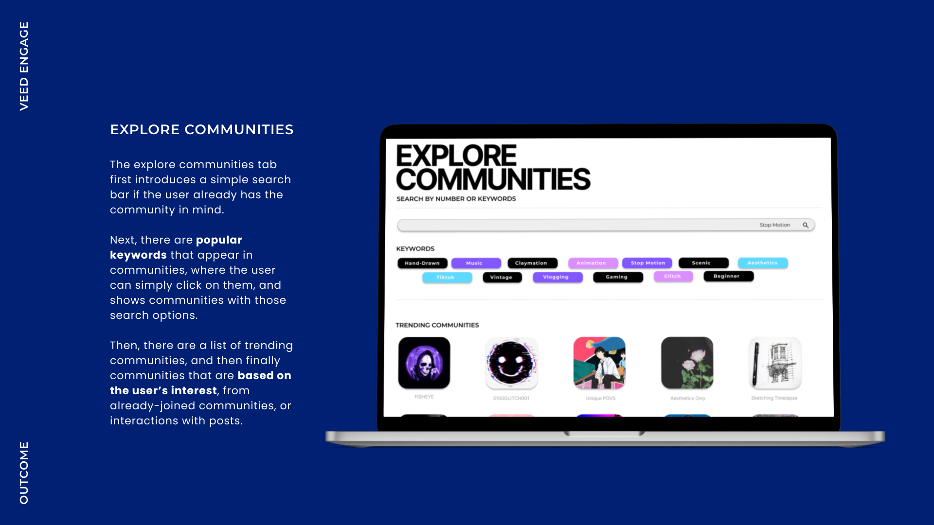
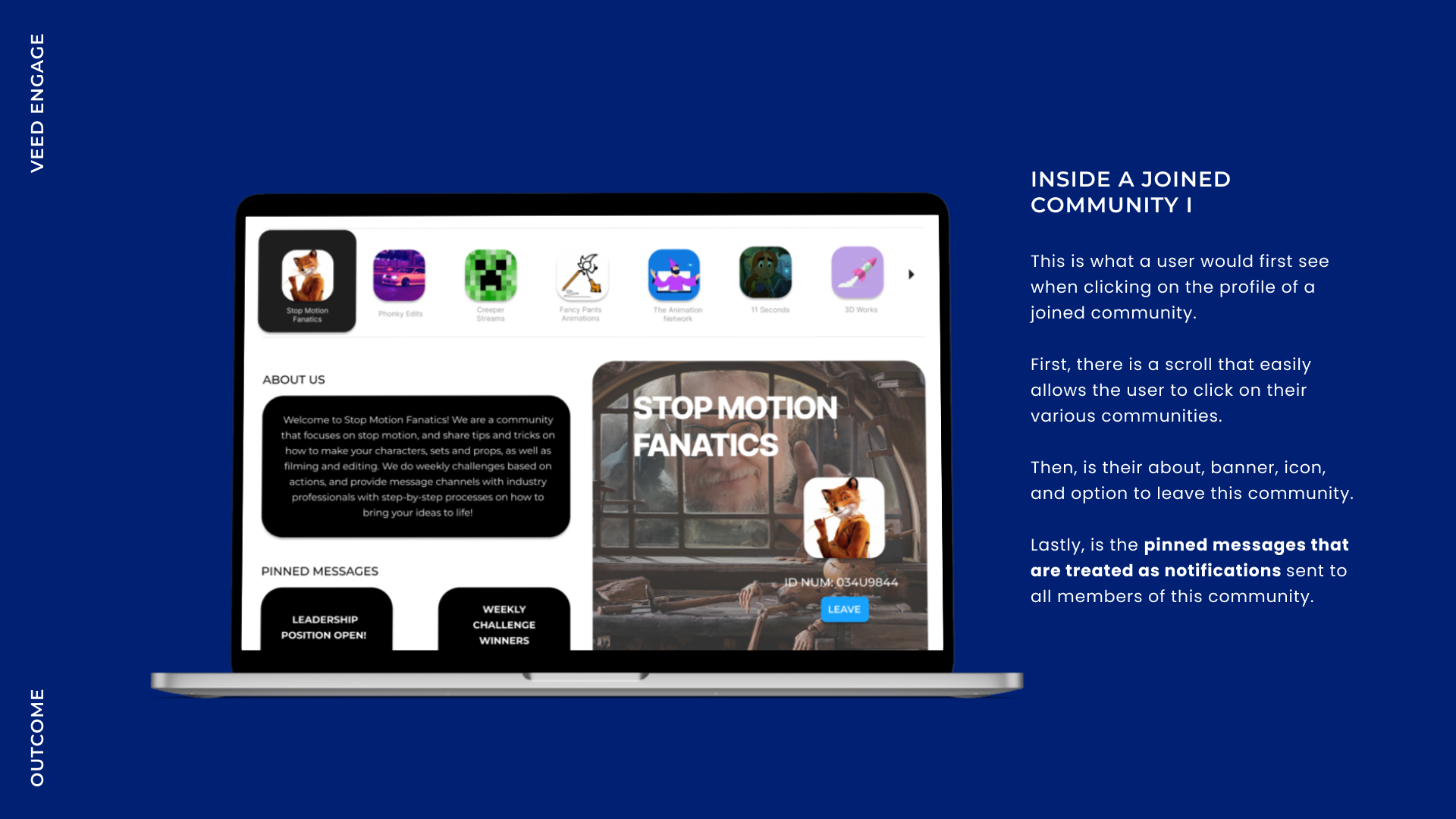
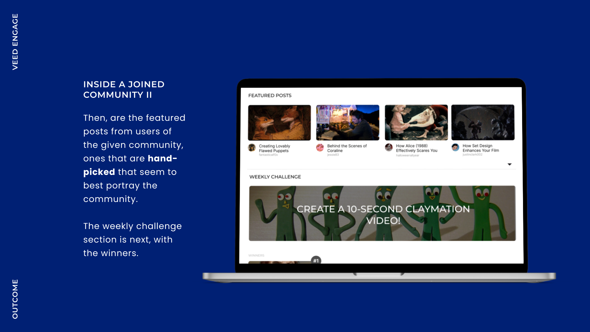
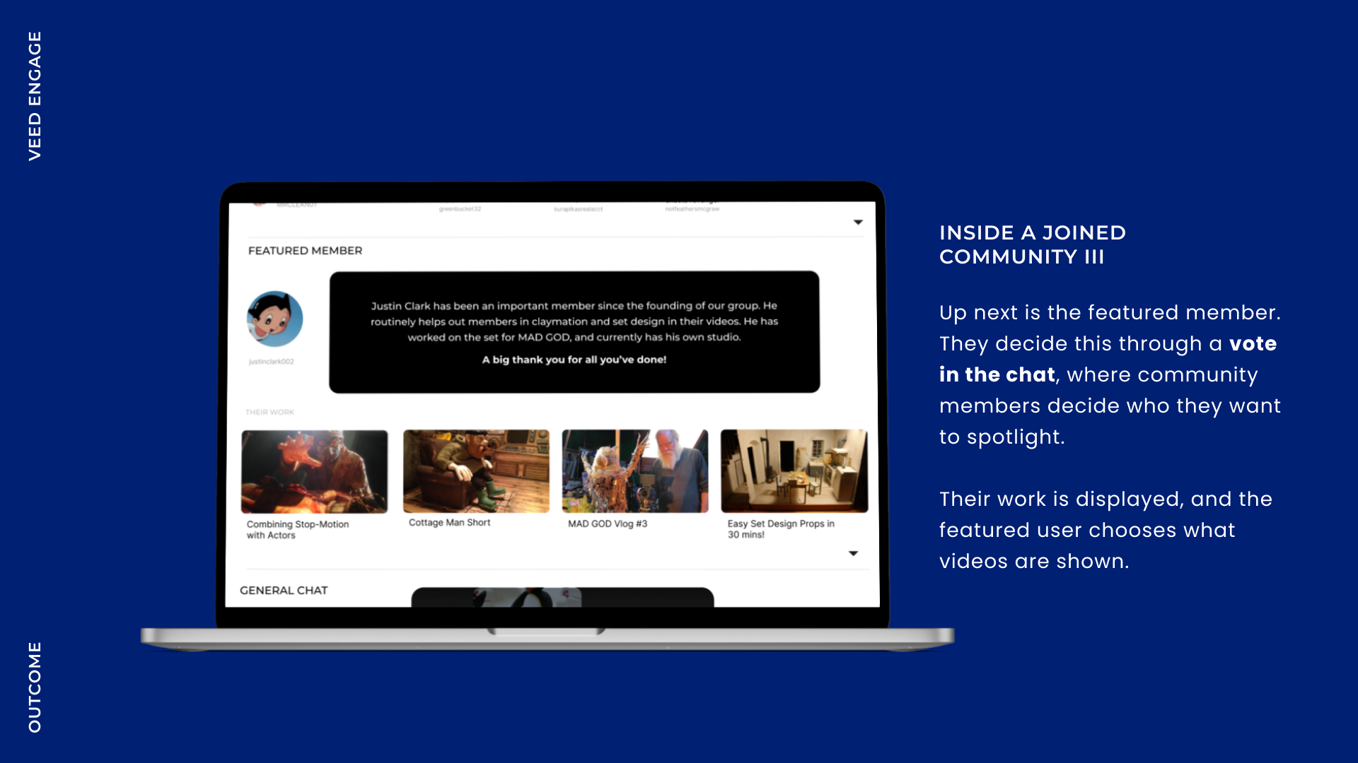
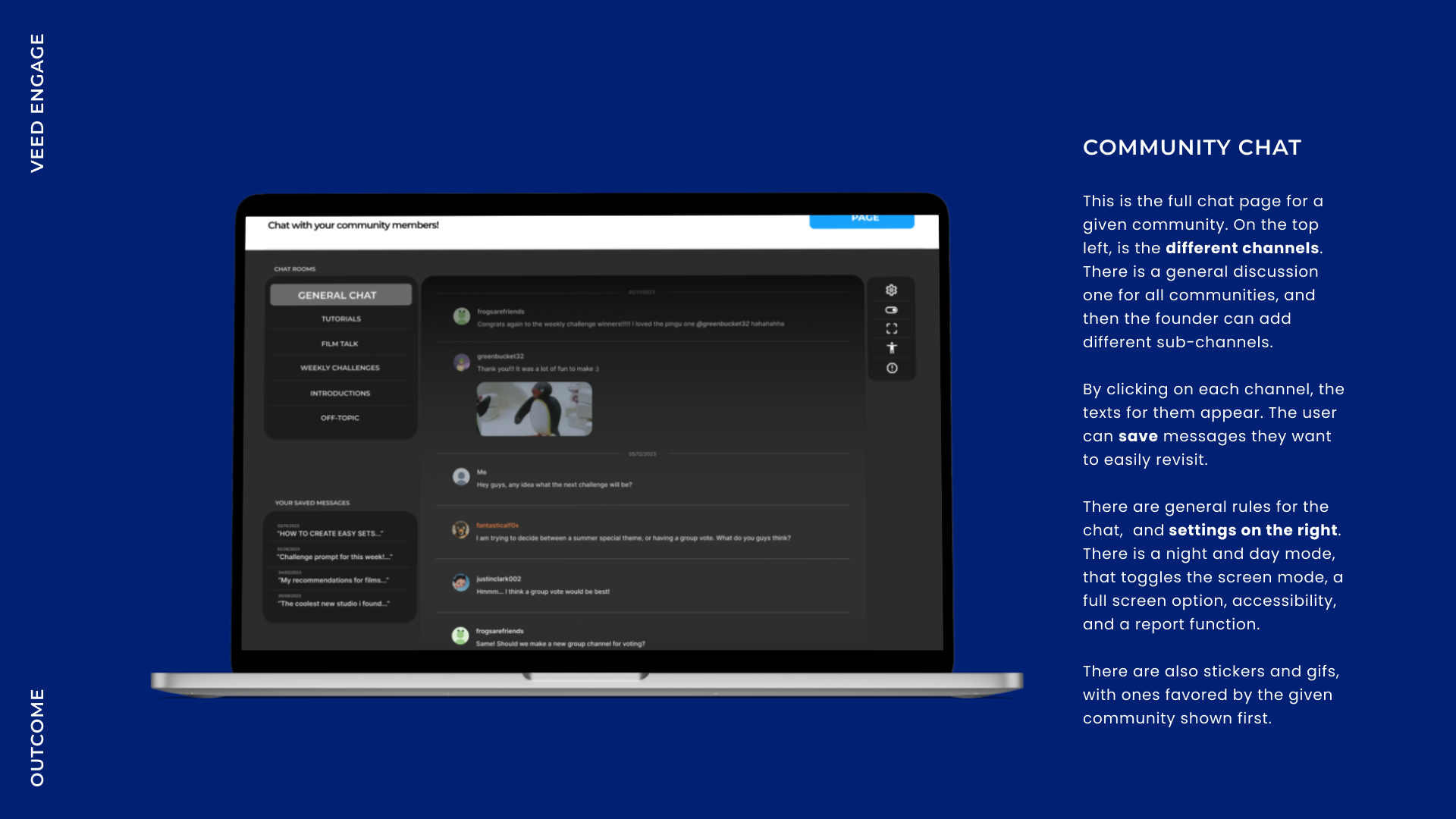
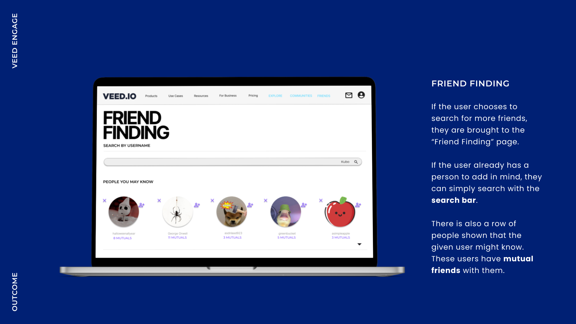
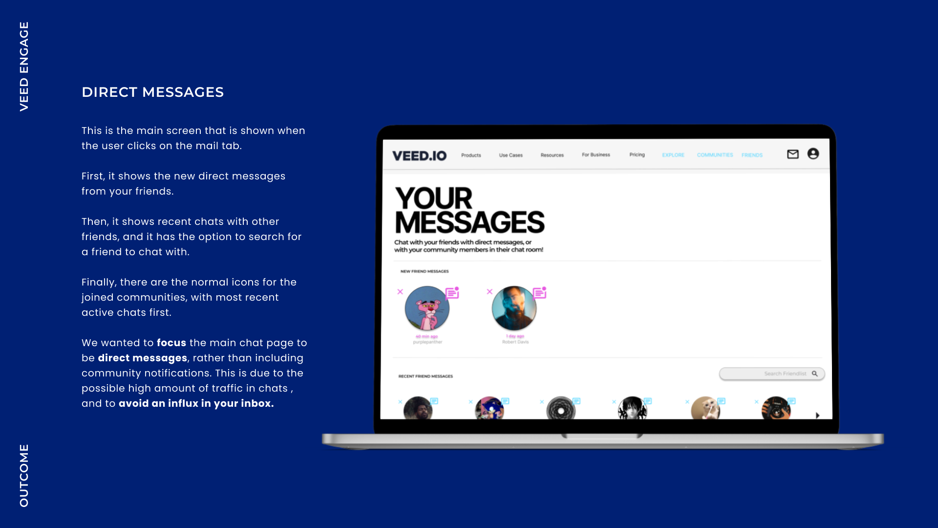
Click below for the Final Prototype on Figma:
04 Process
WIREFRAMES
SKETCHES AND LAYOUT EXPLORATION
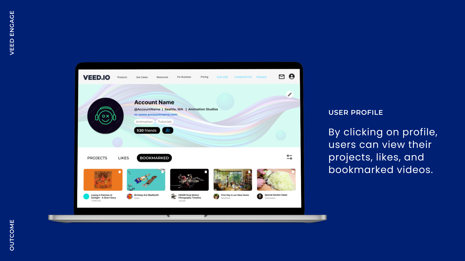
To kick off the ideation process, we began by experimenting with various layouts and sketches. Our goal was to seamlessly integrate Explore, Communities, Find Friends, and User Profile pages into VEED's existing website. To achieve this, we analyzed current video-sharing platforms, aiming to emulate their UI and information hierarchy. My primary focus was strategizing the Explore page, incorporating social features such as comments and sharing, which would complement our direct messaging functionality.
USER TESTING
FEEDBACK AND REVISIONS
We conducted in-depth user testing on our low-fidelity wireframes and discovered that many users felt each page seemed disconnected from the others. To address this, we created a style guide to ensure cohesiveness throughout our prototype. Additionally, we identified navigation issues within the prototype. To resolve this, we made each page title more prominent, making it easier for users to locate them.
STYLE GUIDE
CONSISTENT STYLING GUIDE
Reflection
WHAT I LEARNED
REFRAMING THE DESIGN PROBLEM
When we started researching the problems of VEED's current site, we were overwhelmed by designing a video-based platform and how we were going to make it more engaging than how it currently stands. After a few weeks on this project, I learned so much about designing functional video-sharing platforms and the importance of adding social features like comments, sharing, and private messaging. These features not only boost user engagement but also help users connect, making the platform more than just a place to share videos—it becomes a community.
The scope of this project was much bigger than we anticipated. Creating a functional, cohesive, and fully contextualized prototype is something we aimed to accomplish. We managed to create a diverse array of connected pages that created a flow for our user, but weren’t completely sure how well it functioned in a real context. However, I'm proud of the research done on this project and the complex ideas we were able to capture with simplified solutions.