As a beginner to skincare, I aimed to create a platform to lower the barriers of entry for those alike, offering a beginner-friendly experience and educating users on everything they need to know: from what factors may be causing their skin conditions, to what ingredients truly work for their skin. Zenith addresses skin concerns by offering users insightful skin analysis, educational resources, and scientifically-backed products, all within a streamlined and elegant interface.
Skills
Wireframing, Prototyping, and UX/UI Design
User Research and Strategy
Branding and Visual Identity System
01 Background
WHAT NEEDS FIXING?
THE PROBLEM
Even though skincare is currently all the craze on social media, many beginners don't know where to start. The information to learn about ingredients that go into products or how to build a clear skincare routine with the right products isn't centralized or easily accessible without professional guidance.
WHERE'S THE VALUE?
OPPORTUNITY
One of the ways people can support beginners in their skincare journey is through education. Knowledge has extraordinary power. It acts as a catalyst for building confidence, enhancing self-care routines, and fostering a sense of community. What if we use education as a means to empower skincare beginners? What if we reimagine skincare educational apps to serve a greater purpose than just providing quick tips and product recommendations? Imagine a comprehensive central hub where beginners can learn everything they need to know about skincare, discovering how to care for their skin while learning about the ingredients that are scientifically proven to work.
SOLUTION
MAKE THE SKINCARE EDUCATION TO ROUTINE PROCESS MORE APPROACHABLE, PERSONAL, AND CONSOLIDATED.
02 Solution
KEY FEATURES
DISCOVERABILITY
DISCOVER SKIN TYPES, INGREDIENTS, AND MORE
Beginners to skincare can explore common skin concerns and learn about what factors cause them, specific steps to take to treat them, and which products to use to combat them. Each page displays information in an approachable and digestible scroll, making it simple for users to browse with ease. To discover more, continue scrolling to shop for recommended products and explore ingredients.
AWARENESS
SCIENTIFICALLY BACKED INFORMATION
Each ingredient page includes dermatologist-approved statements and references to scientific studies. Users can trust the research-based facts about how these ingredients perform, with direct access to the supporting scientific studies online. This ensures that the information they receive is both credible and verifiable.
EDUCATION
EXPLORE ADVANCED SKINCARE COURSES
After users explore skin concerns and ingredients, they can delve into advanced "higher education" courses on skincare knowledge. These courses are structured similarly to other educational pages, providing in-depth insights on effective skin care practices.
PERSONALIZATION
GET PERSONALIZED RESULTS
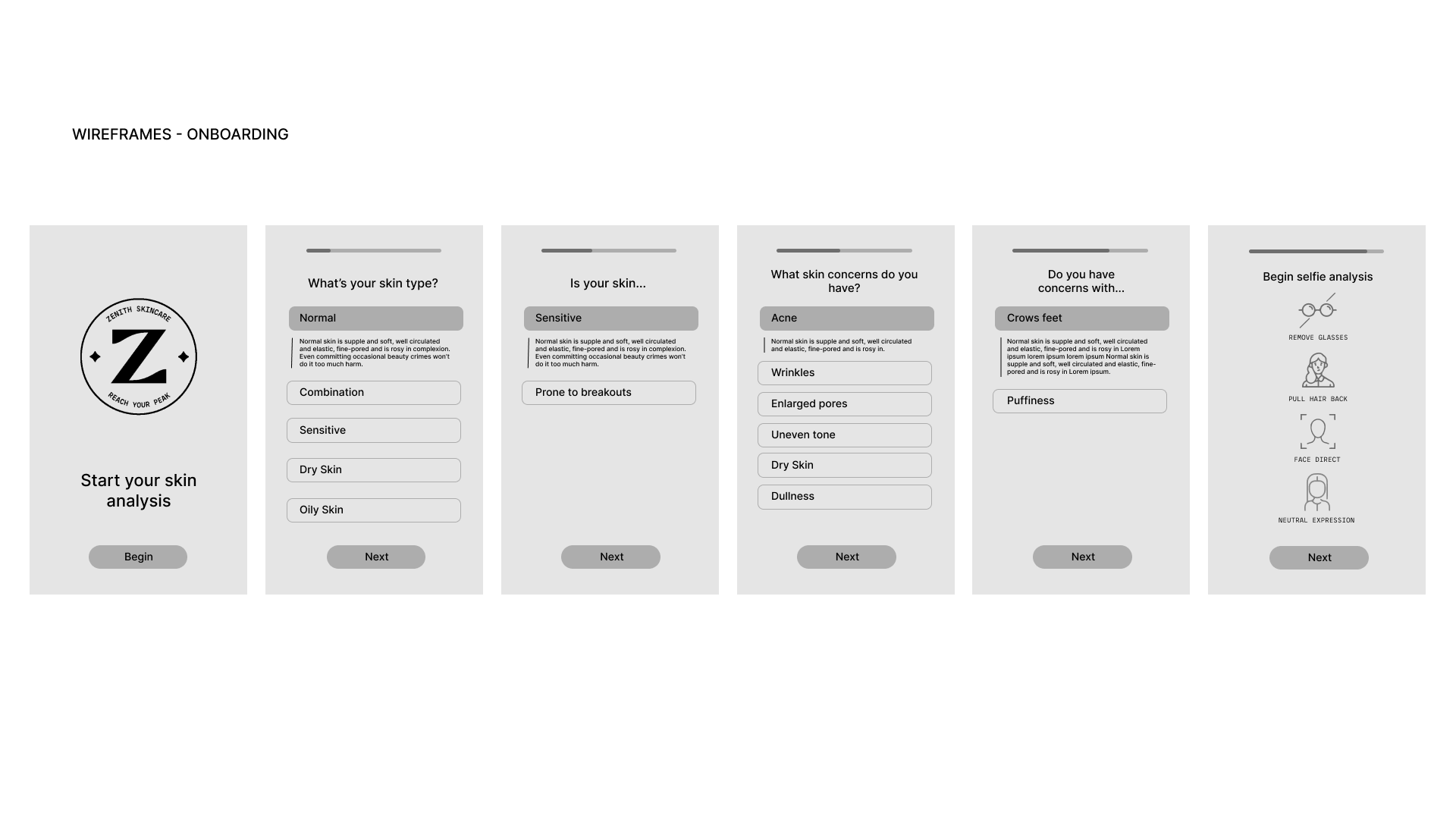
Users are walked through a skin analysis survey as part of the onboarding process. This acts as a guide for daily skincare routines and educates beginners on their skin type. Furthermore, they are generated a list of products tailored to their skincare needs. Users can choose to share this screen on social media or simply save it to their camera roll, creating an engaging and social interaction for the platform.
03 Final Product
Click below for the Final Prototype on Figma:
04 Research
SETTING STANDARDS
DESIGN GOAL FOR SKINCARE EDUCATION
The user experience skincare education for beginners needs to be addressed. As is often with any science, jargon in the dermatology world creates friction for the user experience and can lead to wasted funds and time, leaving beginners confused and frustrated. Ineffective products discourages brand new skincare users to commit to skincare regime. This can frequently occur if not enough research is done prior to purchasing products.
The current state of the skincare industry is inaccessible to those who don't have resources to dermatology care or aren't fully invested in it. They are forced to deal with barriers to entry and decentralized information not meeting user needs. Keeping these pain points in mind, I used affinity diagramming to derive four key design goals to follow during this design process: Discoverability, Awareness, Education, and Personalization.
The current state of the skincare industry is inaccessible to those who don't have resources to dermatology care or aren't fully invested in it. They are forced to deal with barriers to entry and decentralized information not meeting user needs. Keeping these pain points in mind, I used affinity diagramming to derive four key design goals to follow during this design process: Discoverability, Awareness, Education, and Personalization.
MARKET STATISTICS
MARKET FOR SKINCARE
Skin care has become an essential part of many people's routines, offering nourishment, healing, and improved skin quality. Its popularity has surged across all age groups, driven by social media platforms like Instagram, Facebook, and TikTok. Recognizing this trend, I saw an opportunity to raise awareness and educate people about the booming skincare market, highlighting the gaps in meeting specific needs and ensuring efficacy for all skin types. Statistics from Statista.com show that facial skincare has consistently grown in popularity over the past few years and is projected to continue its upward trend.
USER RESEARCH
SURVEY
I conducted an online survey on skincare management. Here are some notable responses to the question:
"What are the biggest challenges you face when it comes to understanding or implementing skincare?”
“Knowing exactly what certain ingredients do.”
"How many products I need to use to treat my skin and how often I should apply them."
“What makes a good skincare routine. Does having more steps in it make it better?”
“How do I know which products I need, and are the best in the market?”
"How many products I need to use to treat my skin and how often I should apply them."
“What makes a good skincare routine. Does having more steps in it make it better?”
“How do I know which products I need, and are the best in the market?”
After asking participants if they trust professional advice over amateur advice, a majority indicated they trust doctors more. However, most participants rely on friends, family, or online advice rather than seeking professional help. I saw this as an opportunity to integrate professional, trusted material into a digital platform, transforming the pain point of seeking skincare advice into a streamlined, single hub.
COMPETITIVE ANALYSIS
WHO ARE THE TOP PLAYERS?
The competitors in the market are primarily personalized skincare platforms operating on prescription or subscription-based models. While subscription programs provide more products for users to try, they often lock users into a non-customizable investment, limiting their control over their spending. This highlighted an opportunity to move away from subscription-based skincare and offer users the flexibility to choose from recommended products without the need for a subscription.
USER PERSONAS
WHO IS OUR TARGET AUDIENCE?
Zenith's target audience is students and working professionals who experience busy lives and are looking for easily accessible ways to learn more about skincare from a beginner's perspective.
05 Process

IDENTIFYING COMMON SKIN CONCERNS
SKINCARE SYNTHESIS
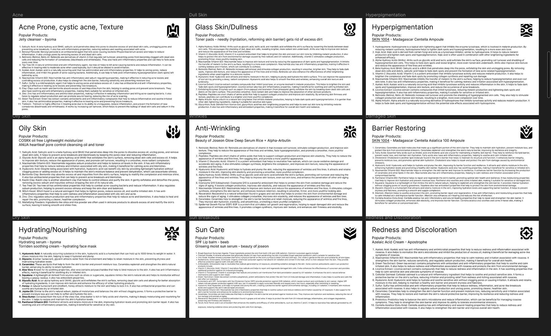
To design skin products for Zenith and provide detailed information on ingredient benefits, I identified nine primary skin concerns and researched the top ten ingredients for each issue. Additionally, I analyzed social media to discover the most popular products used to address each condition. This research inspired me to create distinct icons for each skin concern, making the information more approachable and easily understandable, especially for beginners.
CONCEPTING AND IDEATION
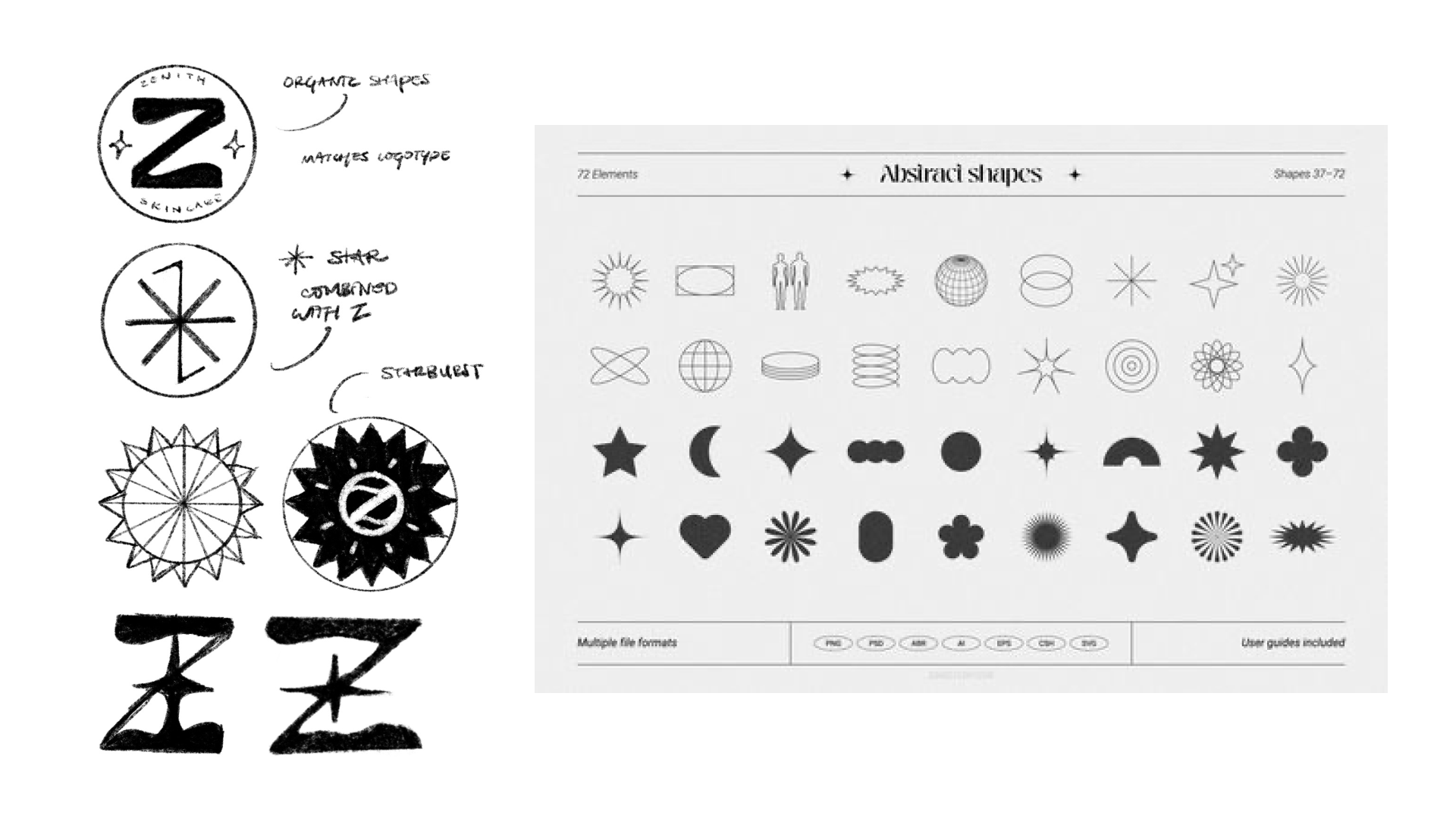
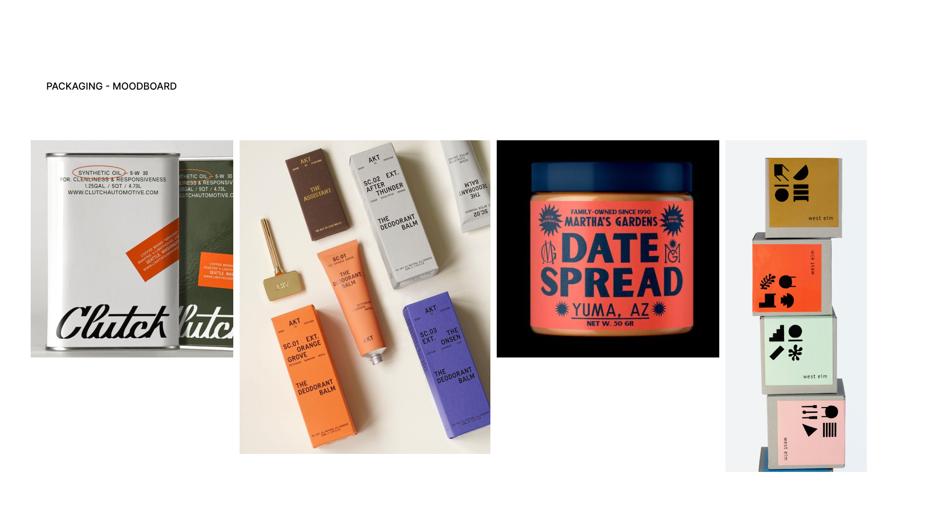
BRAND IDEATION AND WIREFRAMES

INSPIRATION
PERSONALITY QUIZZES
As part of the app's onboarding skin survey, I conducted digital “field research” by observing other platforms or online personality quizzes to learn more about what makes their designs, questions, and results engaging for users.
Personality quizzes engage us by offering a blend of self-discovery, entertainment, and social interaction. They satisfy our curiosity about ourselves and others, providing insights into behaviors and traits. Through sharing results on social media, they facilitate discussion and comparison among peers. Additionally, quizzes often offer validation and a sense of belonging, reinforcing our self-image and connecting us to communities of like-minded individuals.
ITERATE, ITERATE, ITERATE
FEEDBACK AND REVISIONS
After presenting to my cohort, I received feedback suggesting the addition of more screens and a detailed focus on the product-to-consumer side of the app. Additionally, the photography and color scheme initially lacked cohesion. Taking this feedback into account, I refined the color palette and photography to ensure a cohesive look and added several new screens to enhance the app's functionality and user experience.
Reflection
WHAT I LEARNED
THE POWER OF EMPATHY
As I reflect on this 4-week project, I realized that empathy was present throughout the whole journey. Researching how beginners to skincare were struggling to break into skincare and hesitant to invest in the journey sparked the conception of this idea, ultimately guiding me through every design decision. This project is special because it could potentially help people feel less intimidated and more confident in entering the world of skincare and dermatology. Bringing down barriers to entry and increasing accessibility to education are things I personally care a lot about, given my own experience as a semi-beginner to skincare and the lack of resources I faced.
I spent a majority of time researching the skincare landscape and building the brand from scratch. I'm satisfied with the brand as a whole, but I recognize the lack of usability testing. In the future, I plan on conducting user tests and gathering feedback on the flow and functionality from real stakeholders. Furthermore, Non-inclusivity to all skin types and ineffectiveness of products due to lack of customization are continuing challenges. Hence, I hope to introduce more custom options to Zenith in the future to make it more accessible to users with more severe skin conditions and provide more avenues to skin research.